CHAPTER 02 · BRAND & VISUAL DESIGN

CHAPTER 02 · BRAND & VISUAL DESIGN

02

02

02

Giving brands a face.

Giving brands a face.

Giving brands a face.

From 2011 to 2024 I worked on brands in Taipei, taking visual identity, packaging, e‑commerce and product content from concept through production. This chapter follows one of them, LEXFUN, from the first pencil sketch to its website and social feed.

From 2011 to 2024 I worked on brands in Taipei, taking visual identity, packaging, e‑commerce and product content from concept through production. This chapter follows one of them, LEXFUN, from the first pencil sketch to its website and social feed.

From 2011 to 2024 I worked on brands in Taipei, taking visual identity, packaging, e‑commerce and product content from concept through production. This chapter follows one of them, LEXFUN, from the first pencil sketch to its website and social feed.

LEXFUN CASE

LEXFUN CASE

2011–2024

2011–2024

FIT, NEW YORK

FIT, NEW YORK

Cover slide 'Exploration: Brand Visual Design / Development' beside a collage of LEXFUN work: the website on a laptop and phone, two style boards, the Smart Badge box and portraits

ROLE

ROLE

Brand, product & design roles · Taipei

Brand, product & design roles · Taipei

Brand, product & design roles · Taipei

WHEN

WHEN

2011–2024

2011–2024

2011–2024

EMPLOYERS

EMPLOYERS

EVOUNI · Aqua Omega · Keyjoy · LEXFUN · Regentronic

EVOUNI · Aqua Omega · Keyjoy · LEXFUN · Regentronic

EVOUNI · Aqua Omega · Keyjoy · LEXFUN · Regentronic

SCOPE

SCOPE

Visual identity · packaging · e‑commerce · product content

Visual identity · packaging · e‑commerce · product content

Visual identity · packaging · e‑commerce · product content

01 / 04 · STORY

01 / 04 · STORY

Start with the story

Start with the story

Start with the story

LEXFUN was a new brand from a cable-assembly manufacturer with decades of experience, stepping into a crowded market for electronics accessories. Instead of inventing a story, we built the brand on that craft. I helped narrow the ideas down to a mission statement and a brand story, answering three questions: who the brand is, which problem it solves, and how we would deliver it.

LEXFUN was a new brand from a cable-assembly manufacturer with decades of experience, stepping into a crowded market for electronics accessories. Instead of inventing a story, we built the brand on that craft. I helped narrow the ideas down to a mission statement and a brand story, answering three questions: who the brand is, which problem it solves, and how we would deliver it.

LEXFUN was a new brand from a cable-assembly manufacturer with decades of experience, stepping into a crowded market for electronics accessories. Instead of inventing a story, we built the brand on that craft. I helped narrow the ideas down to a mission statement and a brand story, answering three questions: who the brand is, which problem it solves, and how we would deliver it.

LEXFUN brand strategy board: mission, brand philosophy, concept exploration and brand story panels, with a modern building and an open notebook beside a latte

01 / 04

01 · LEXFUN brand strategy board

01 · LEXFUN brand strategy board

ENLARGE

ENLARGE

LEXFUN logo development: pencil sketches of cube marks on dotted paper, ten wordmark options and a three-step hexagon icon evolution

02 / 04

02 · Logo development, sketch to icon

02 · Logo development, sketch to icon

ENLARGE

ENLARGE

02 / 04 · LOGO

02 / 04 · LOGO

Sketch, test, simplify

Sketch, test, simplify

Sketch, test, simplify

The logo started in a dotted notebook. The idea was a cube: technology with a youthful touch, shaped like a box with a present inside. I sketched symbols and wordmarks, then cut them down round by round, testing color, silhouette and layout. The thin hexagon outline grew into a bold stroke, and the last two letters, U and N, merged into one glyph. Simple, memorable, still playful.

The logo started in a dotted notebook. The idea was a cube: technology with a youthful touch, shaped like a box with a present inside. I sketched symbols and wordmarks, then cut them down round by round, testing color, silhouette and layout. The thin hexagon outline grew into a bold stroke, and the last two letters, U and N, merged into one glyph. Simple, memorable, still playful.

The logo started in a dotted notebook. The idea was a cube: technology with a youthful touch, shaped like a box with a present inside. I sketched symbols and wordmarks, then cut them down round by round, testing color, silhouette and layout. The thin hexagon outline grew into a bold stroke, and the last two letters, U and N, merged into one glyph. Simple, memorable, still playful.

“

“

“

FROM PART 02 · LOGO

FROM PART 02 · LOGO

Simple, memorable, still playful.

Simple, memorable, still playful.

Simple, memorable, still playful.

03 / 04 · GUIDE

03 / 04 · GUIDE

A guide, then the real world

A guide, then the real world

A guide, then the real world

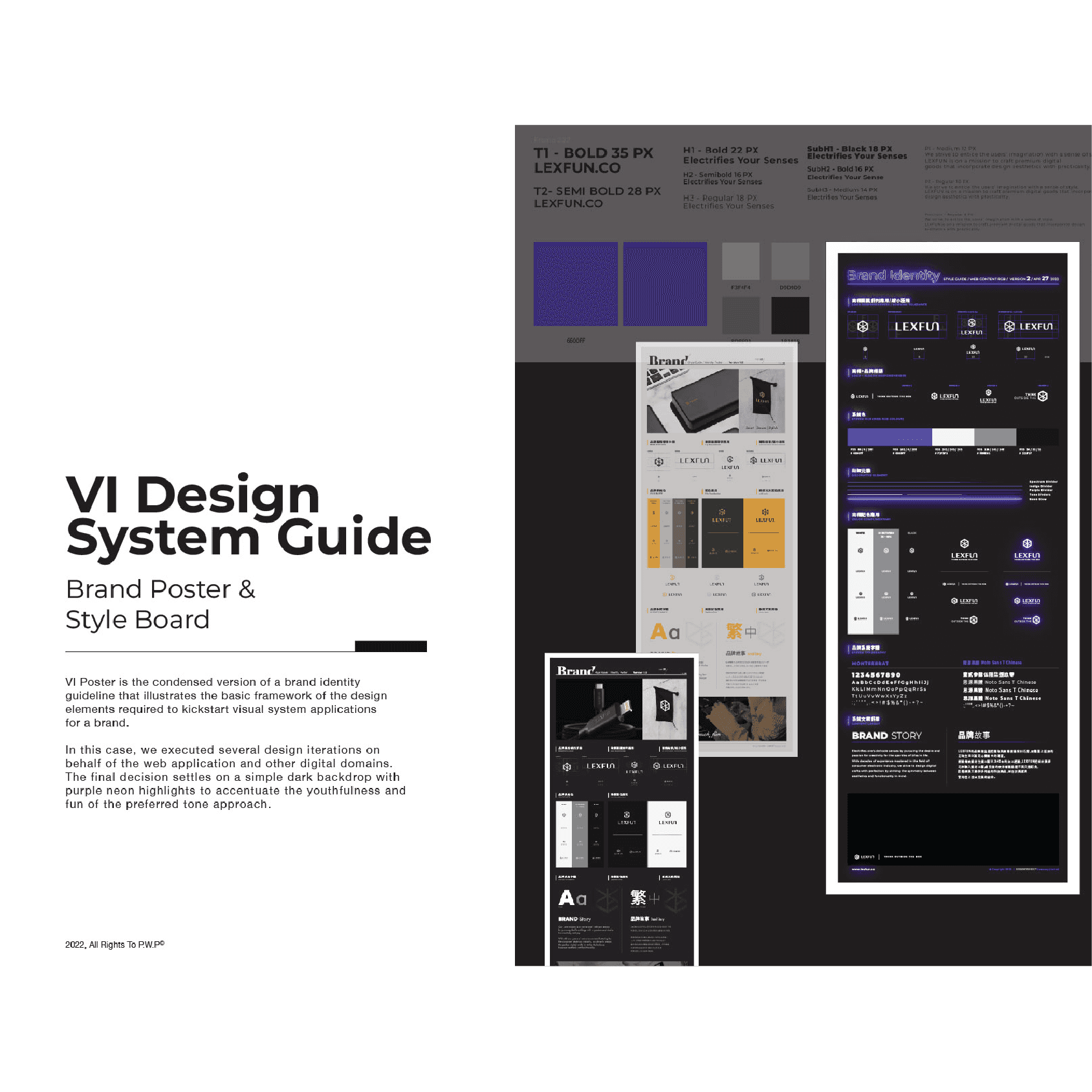
Next I condensed the identity into one poster: the lockups, colors and type anyone needed to start using the brand. We tried several looks and chose a dark background with purple neon highlights, which kept the tone young and fun. Then I mocked the logo up on billboards, a delivery van and the products, so everyone could picture it in the real world while it was still a draft.

Next I condensed the identity into one poster: the lockups, colors and type anyone needed to start using the brand. We tried several looks and chose a dark background with purple neon highlights, which kept the tone young and fun. Then I mocked the logo up on billboards, a delivery van and the products, so everyone could picture it in the real world while it was still a draft.

Next I condensed the identity into one poster: the lockups, colors and type anyone needed to start using the brand. We tried several looks and chose a dark background with purple neon highlights, which kept the tone young and fun. Then I mocked the logo up on billboards, a delivery van and the products, so everyone could picture it in the real world while it was still a draft.

LEXFUN visual identity guide: type scale, purple and gray swatches, and three brand posters in light, dark and purple-neon versions

03 / 04

03 · Visual identity guide

03 · Visual identity guide

ENLARGE

ENLARGE

LEXFUN logo mockups on two billboards and a delivery van, the web shop on a phone, and a black power bank, earbud case and charger on marble

04 · Mock-ups: billboards, van, products

04 · Mock-ups: billboards, van, products

ENLARGE

ENLARGE

LEXFUN website design: desktop page layouts, a UI style guide with type and buttons, and the site on a laptop, tablet and phone

04 / 04

05 · LEXFUN website and UI style guide

05 · LEXFUN website and UI style guide

ENLARGE

ENLARGE

Keyjoy mobile website process in three diagonal panels: pencil hand draft, gray low-fidelity wireframe and high-fidelity mockup of a cable-assembly manufacturer's site

06 · Keyjoy mobile site: draft to mock-up

ENLARGE

LEXFUN marketing collateral: dark e-banners for the Smart Badge holder and the S.Café woven cable, and Chinese-language social posts

07 · E-banners and social posts

ENLARGE

04 / 04 · SCREENS

04 / 04 · SCREENS

On screen and in the feed

On screen and in the feed

On screen and in the feed

The same system carried into the LEXFUN website, on desktop and mobile, with its own UI style guide, then into e‑banners and Chinese-language social posts for the Smart Badge holder. Web pages started on paper, too: for Keyjoy’s mobile site I went from a pencil draft to a gray wireframe to a high-fidelity mockup, one step at a time.

The same system carried into the LEXFUN website, on desktop and mobile, with its own UI style guide, then into e‑banners and Chinese-language social posts for the Smart Badge holder. Web pages started on paper, too: for Keyjoy’s mobile site I went from a pencil draft to a gray wireframe to a high-fidelity mockup, one step at a time.

The same system carried into the LEXFUN website, on desktop and mobile, with its own UI style guide, then into e‑banners and Chinese-language social posts for the Smart Badge holder. Web pages started on paper, too: for Keyjoy’s mobile site I went from a pencil draft to a gray wireframe to a high-fidelity mockup, one step at a time.

CONTACT

Let’s talk.

Let’s talk.

Let’s talk.

Open to security operations and safety roles, and always up for a good conversation about any of the six chapters.

Open to security operations and safety roles, and always up for a good conversation about any of the six chapters.

© 2026 PETER W. PAN · BEAR ON WATCH